I enjoy photo retouching and building entire scenes in Photoshop because it’s an artform in itself. Sophisticated retouching requires strong attention to detail combined with a keen awareness for and an understanding of light and shadow to make it visually convincing and I really like that challenge.
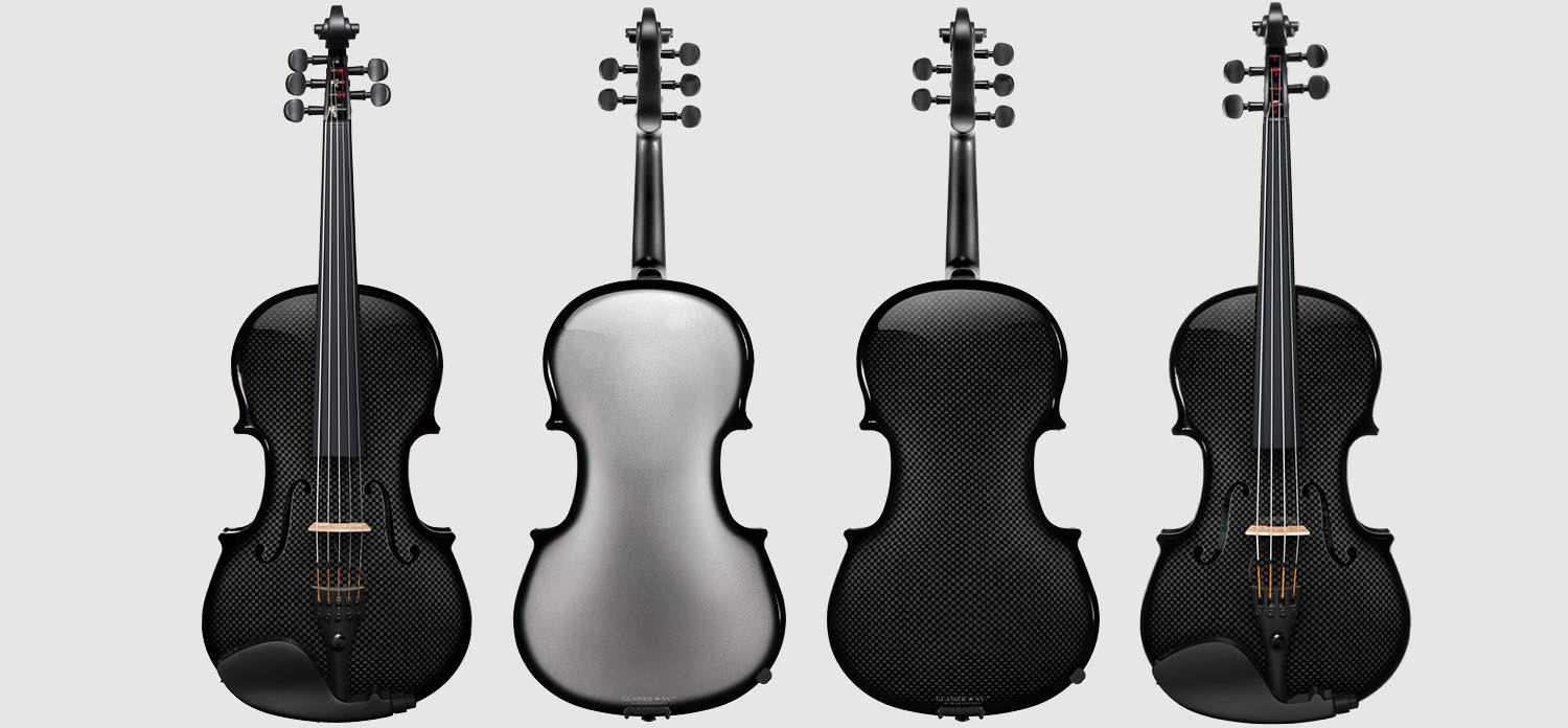
Viola Product Line Images
Step 1:
First, I shot fronts and backs of neutral colored violas with different string configurations to use as my base art. (To add a little difficulty to this project, the checkboard pattern that is an inherent part of this carbon-fiber is inconsistent. So, before moving on from this stage, the client required that all the little squares be manicured to make them look consistent.)
Step 2:
I cut up the base photos to create metallic & carbon-fiber body fills, front & back modals, and 4 string & 5 string component overlays. I also created shadow, reflection, and highlight overlays.
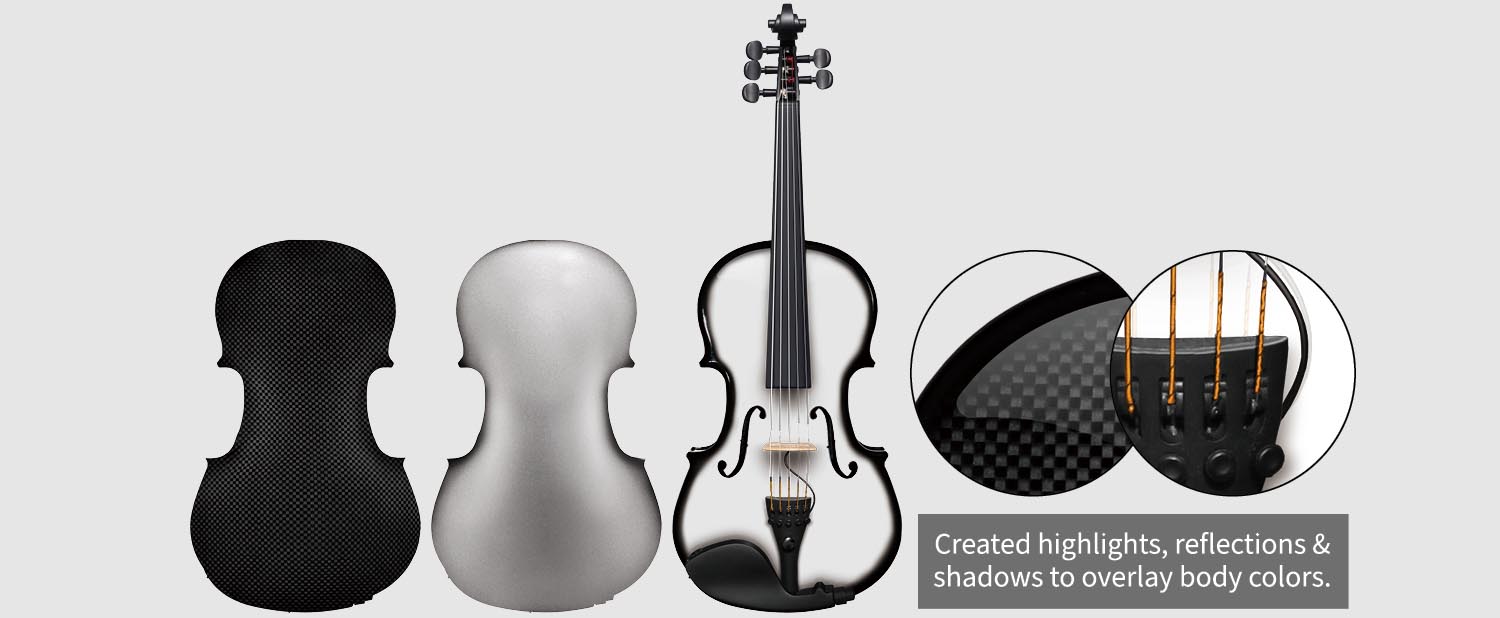
Step 3:
I combined a set of parts for a 5 string front, then adjusted body colors to produce the full line of colors for review.
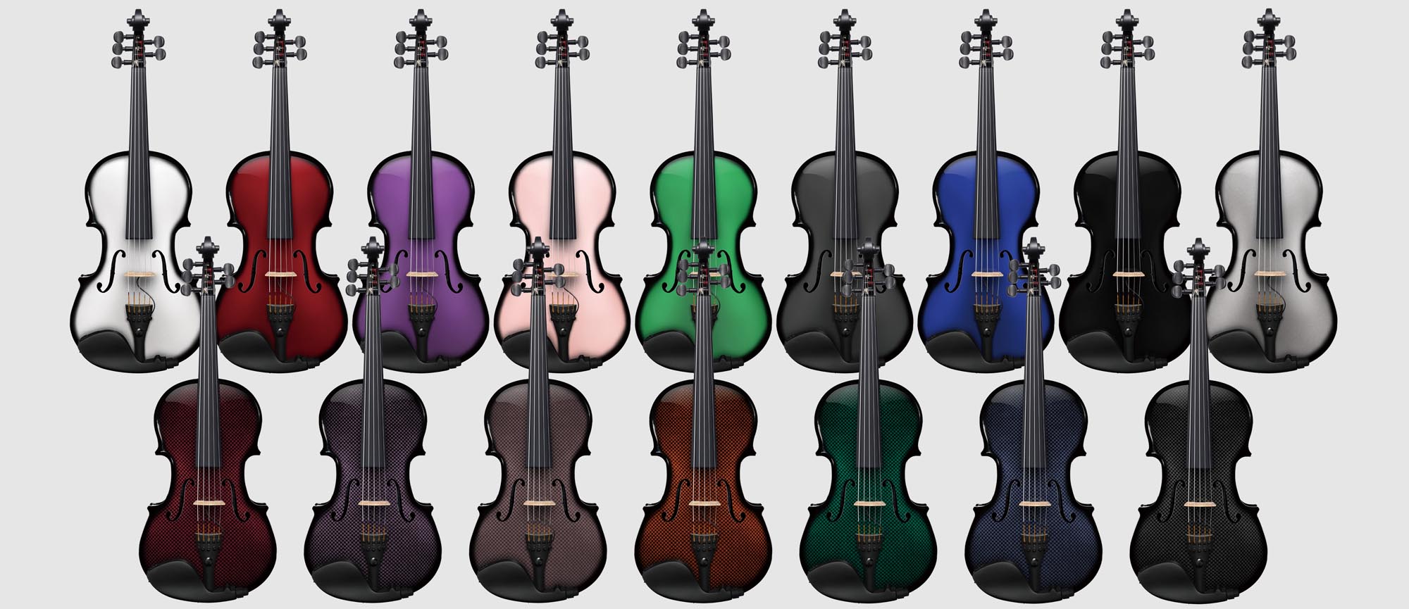
Step 4:
With colors approved, I made all fronts and backs in both 4 and 5 string configurations and in all the available colors (64 images).
Email Blast Campaign
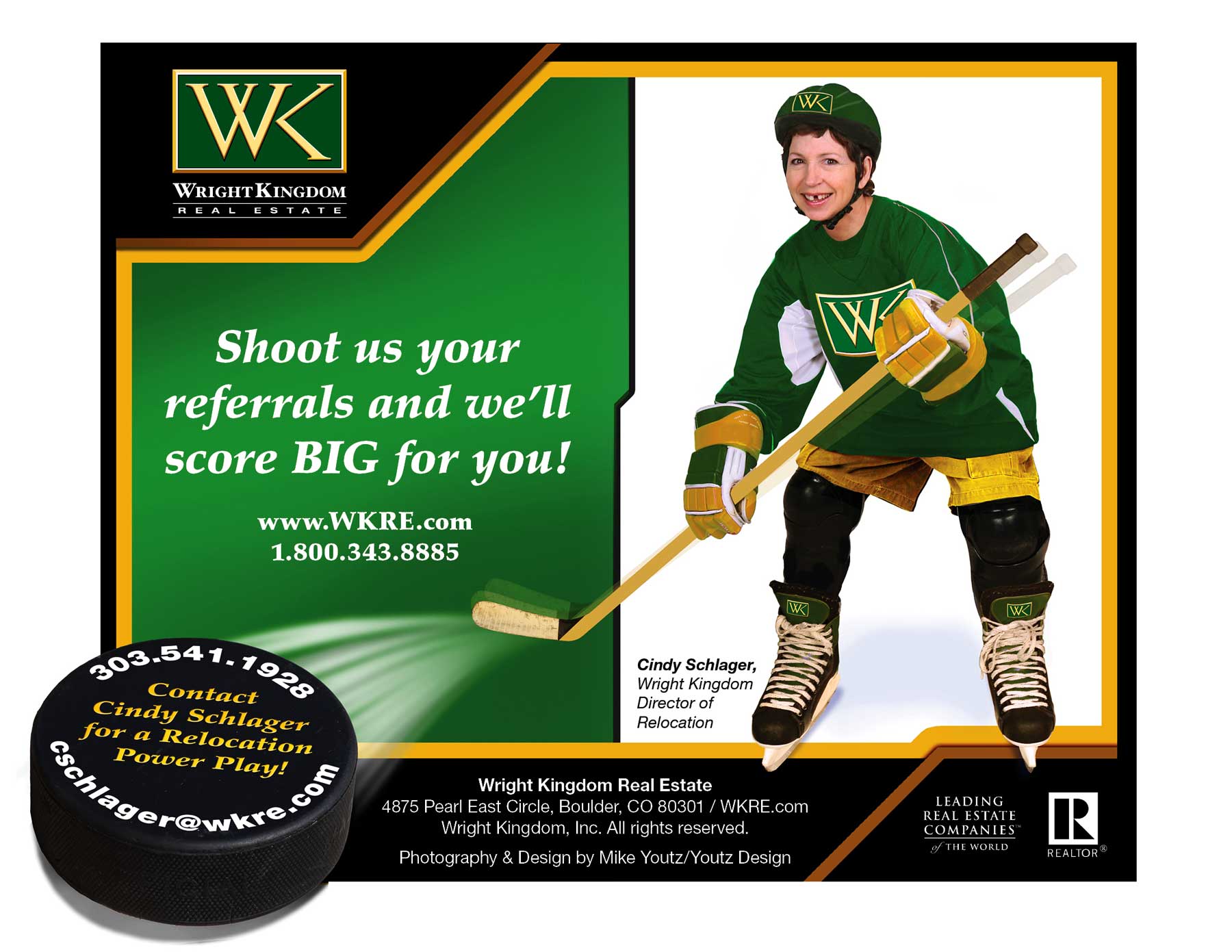
For this award-wining 7 year email campaign, I did all the photography (I did combine my original shots with stock in some editions), concepting, photo-manipulation and design.
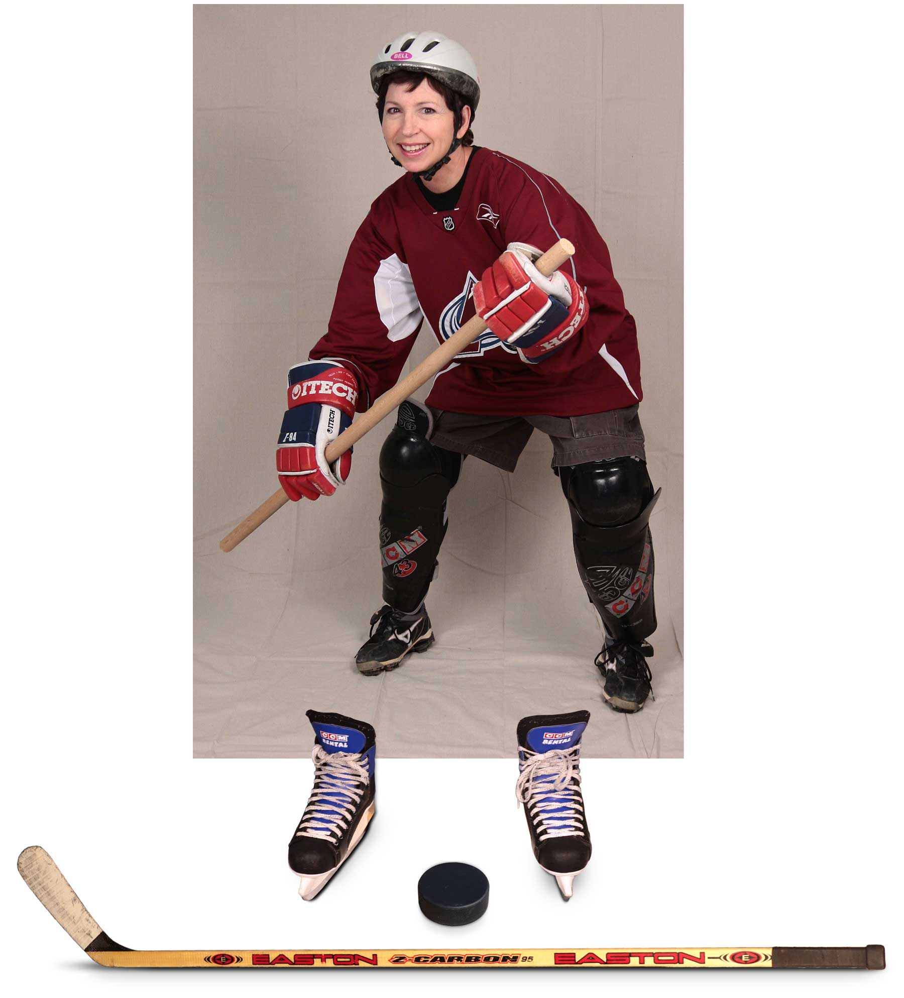
For this particular edition of the campaign, I shot my client wearing an Avs jersey, a bicycle helmet, tennis shoes and holding a long dowel (shown below). Then, I went to the Superior skating rink where they were kind enough to loan me some skates, a hockey stick, and a puck for a couple hours. I photographed those items positioned to the portait I’d already shot and built the whole ad in Photoshop.
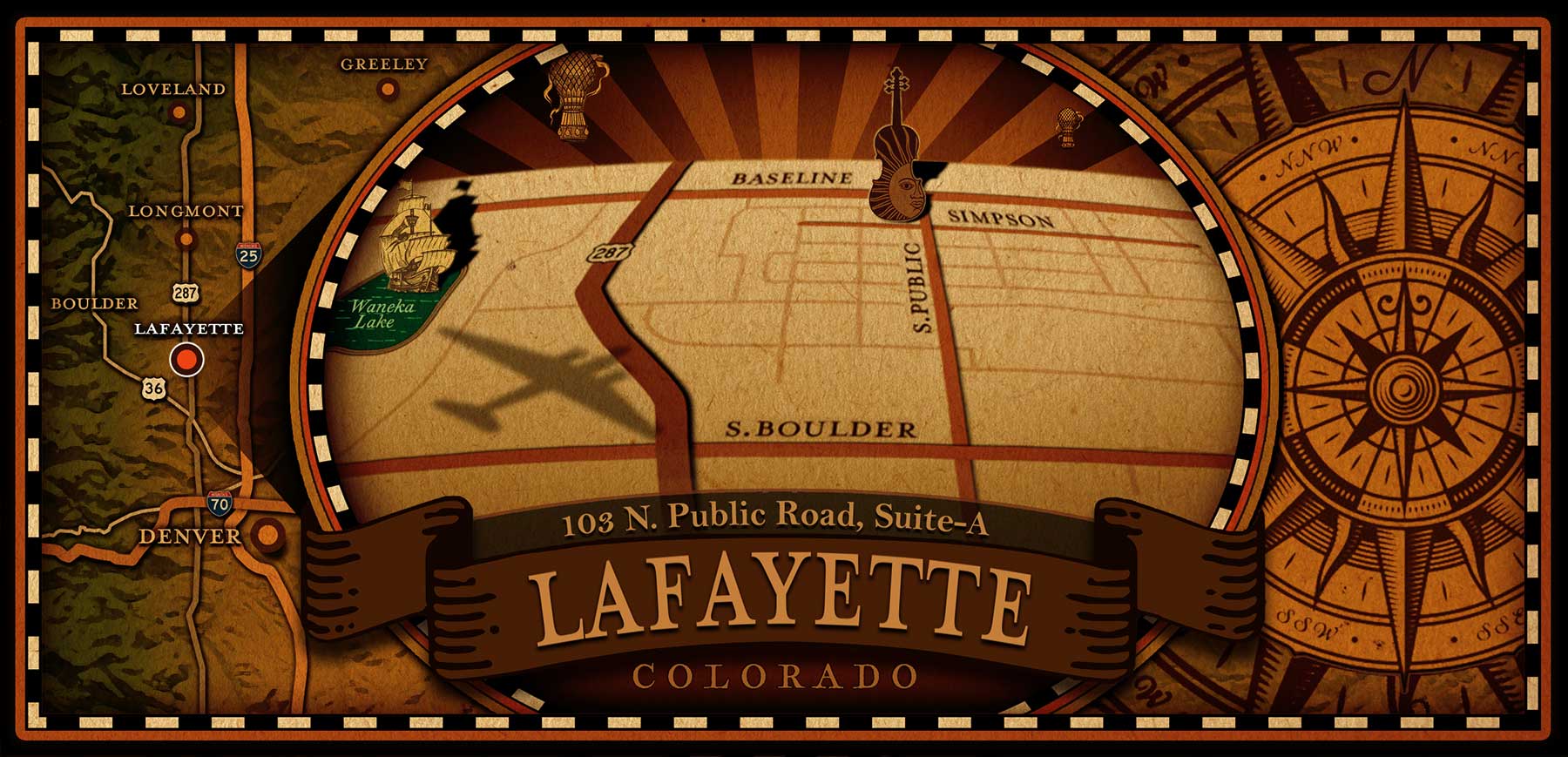
“Steampunk” Map
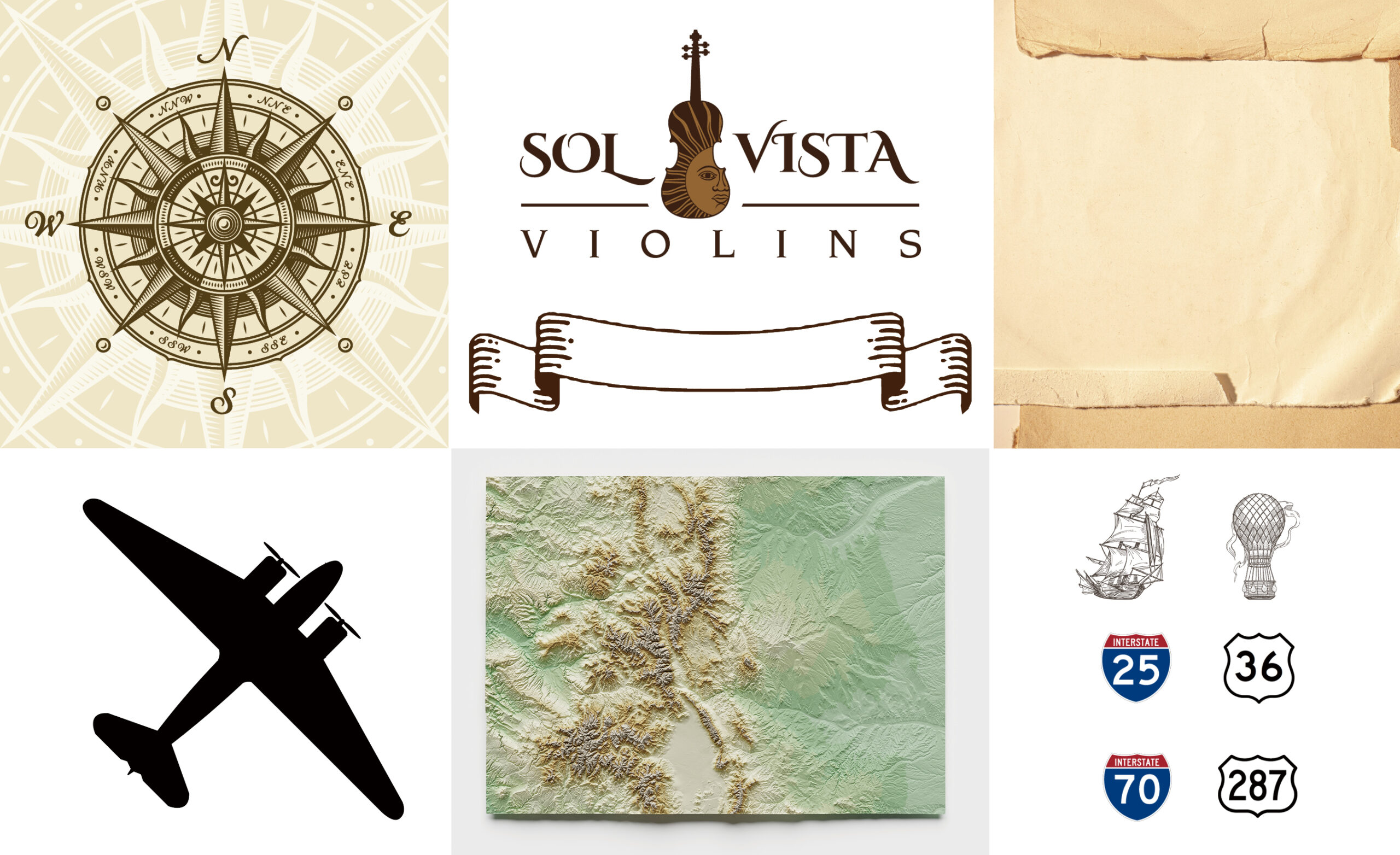
In this map, I created the streets and distorted type in Illustrator, then brought it into Photoshop as vector smart objects. I combined those elements with the above graphics to design and build this map. I used a warm brown/tan color pallet to harmonize with the website that I also built.
